Logo Design
Photoshop | Figma
.svg)
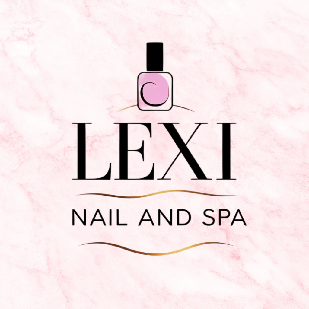
The Lexi Nail and Spa logo was designed to reflect the brand’s essence of modern elegance, femininity, and serenity—qualities that define both the services offered and the story behind the salon. Owned and operated by a passionate mother-daughter duo, the business is built on a foundation of care, creativity, and generational beauty expertise. This personal connection inspired a logo that feels warm, graceful, and approachable, while still exuding professionalism.
The design features a refined, script-style typeface that evokes a sense of beauty and sophistication. The flowing lines symbolize the nurturing touch and attention to detail the team brings to every client experience. Paired with minimalist, modern elements, the logo remains timeless and versatile across all platforms—from storefront signage to social media.
The primary color used in the logo is a soft lavender-purple, a hue traditionally associated with luxury, grace, and calm. Purple also symbolizes creativity and femininity—an ideal fit for a brand rooted in self-expression and self-care. Lavender, in particular, evokes a peaceful, spa-like ambiance, reinforcing the relaxing environment Lexi Nail and Spa is known for.
This palette not only aligns with the salon’s services but also honors the elegant and welcoming atmosphere created by its owners. Supporting tones are kept neutral, enhancing the brand’s adaptability across digital and print materials while keeping the focus on the signature purple.
Together, these elements form a visual identity that is both personal and polished—perfectly capturing the heart and vision of a salon led by two generations of women in beauty.