CRVNCHMODE / Automotive · Design + build
A smarter way
to choose a car.
A guided car-buying experience that brings budget, lifestyle and confidence into the same decision.
- ROLE
- UX/UI Designer + Front-End Developer
- FOCUS
- Guided discovery + explainable recommendations
- DELIVERABLES
- Responsive web app + interactive quiz
- TOOLS
- Figma · Claude · VS Code · Vercel
AT A GLANCE
- The problem
- Car buyers piece together reviews, listings, insurance estimates and calculators to answer one question: is this car right for my life?
- My role
- Solo: concept, UX/UI, visual identity and the front-end build.
- What I built
- A responsive web app with a 10-question Smart Buyer Quiz, top-three matches and an explainable CrunchScore.
- Key decision
- Break the recommendation into five visible pillars instead of one opaque rating, and show red flags next to every match.
- Skills shown
- Decision UX · Information architecture · Content + SEO strategy · Front-end prototyping
Self-initiated concept. The live prototype uses mock data. Scores, prices and vehicle figures illustrate the design; they are not real ratings or measured results.
01 / THE PROBLEM
Too many tabs. Not enough clarity.
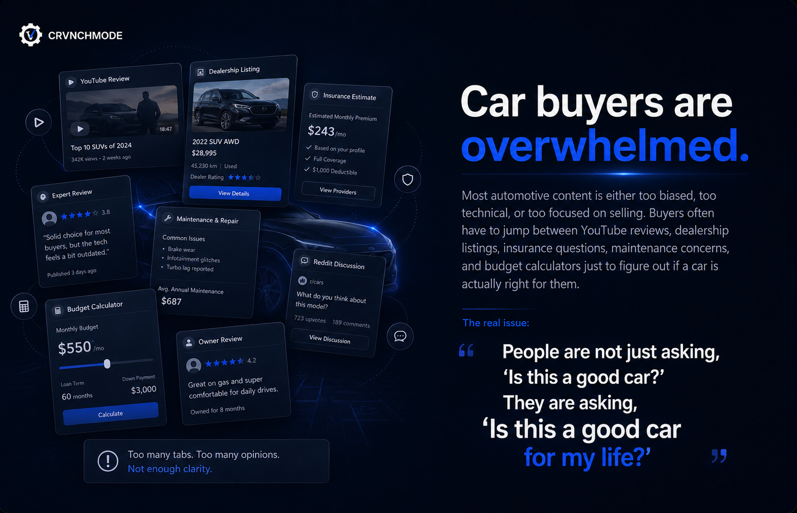
Researching a car means jumping between YouTube reviews, dealership listings, insurance estimates, maintenance forums, Reddit threads and budget calculators. Each one answers a piece of the question. None of them connect it to the buyer’s actual situation.
People aren’t just asking “Is this a good car?” They’re asking “Is this a good car for my life?”
02 / THE OPPORTUNITY
A trusted advisor, not a sales funnel.
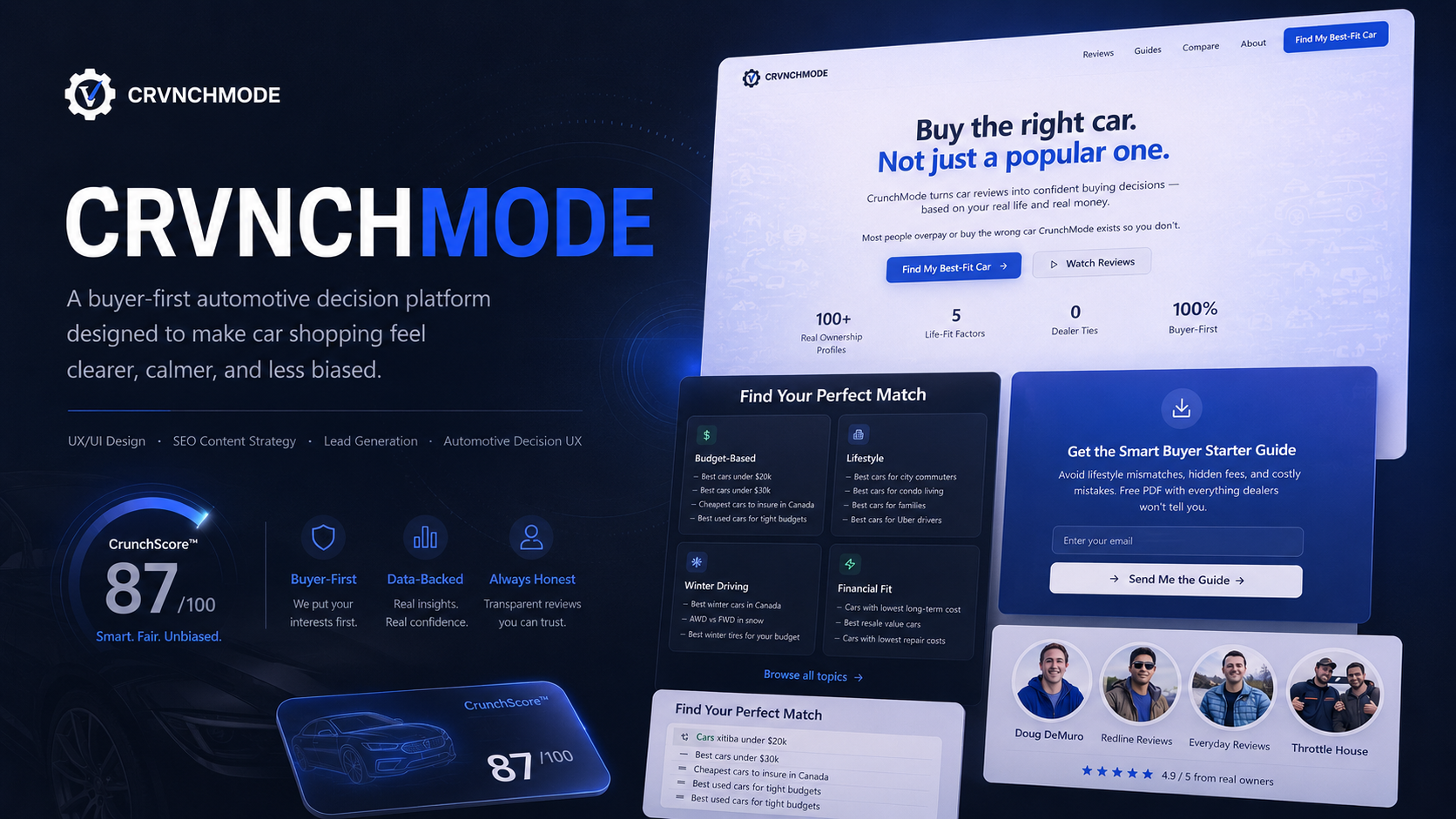
Most automotive sites are built to sell a specific car. I wanted to explore what it would look like if the platform was on the buyer’s side first: starting from their budget and needs, being honest about trade-offs, and only asking for contact details once it had earned them.
03 / THE FRAMEWORK
Five questions every buyer is really asking.
Before designing screens, I defined the factors the product had to reason about. These became the structure for the quiz, the score and the content.
Financial reality
What will this car actually cost to own, not just to buy?
Lifestyle fit
Does it work for commuting, winter driving, family needs, city parking or long trips?
Reliability risk
What should a buyer know before committing?
Content confidence
Can reviews, videos and guides be organized into one clear path?
Lead quality
Can people be guided to act only once they understand what they need?
04 / THE SMART BUYER QUIZ
Turning vague shopping into a guided decision.
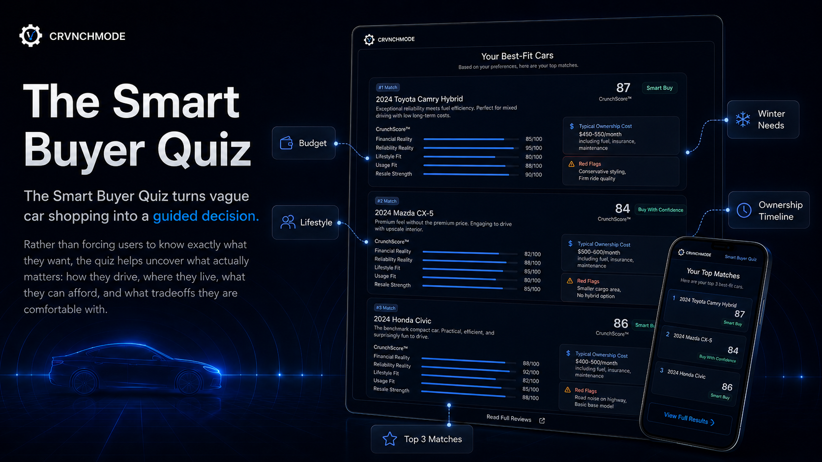
Instead of asking people to already know what they want, the quiz asks what they do know: budget range, how and where they drive, winter needs and how long they plan to own the car. Ten short questions, one per screen, with a visible progress bar.
Results show three matches, not thirty. Each match pairs the score with a typical monthly ownership cost and a Red Flags line (“Smaller cargo area”, “Road noise on highway”). Showing the downsides up front was a deliberate trust decision: a buyer-first product has to say what a dealer wouldn’t.
05 / EXPLAINABLE SCORING
A score you can see inside.
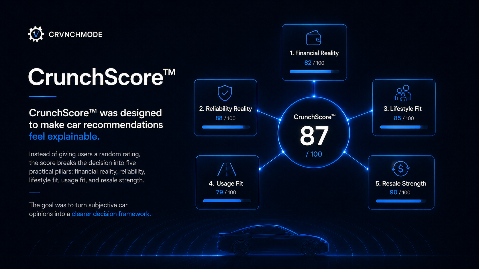
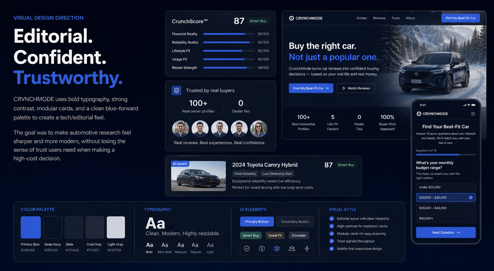
A single “87/100” asks for blind trust. CrunchScore breaks every recommendation into five pillars (financial reality, reliability, lifestyle fit, usage fit and resale strength) with a bar for each, so the buyer can see why a car ranks where it does and which trade-off they’re accepting.
Plain labels (“Smart Buy”, “Buy With Confidence”) sit next to the number for people who just want the verdict.
06 / SEARCH + DISCOVERY
Meeting buyers where they already search.
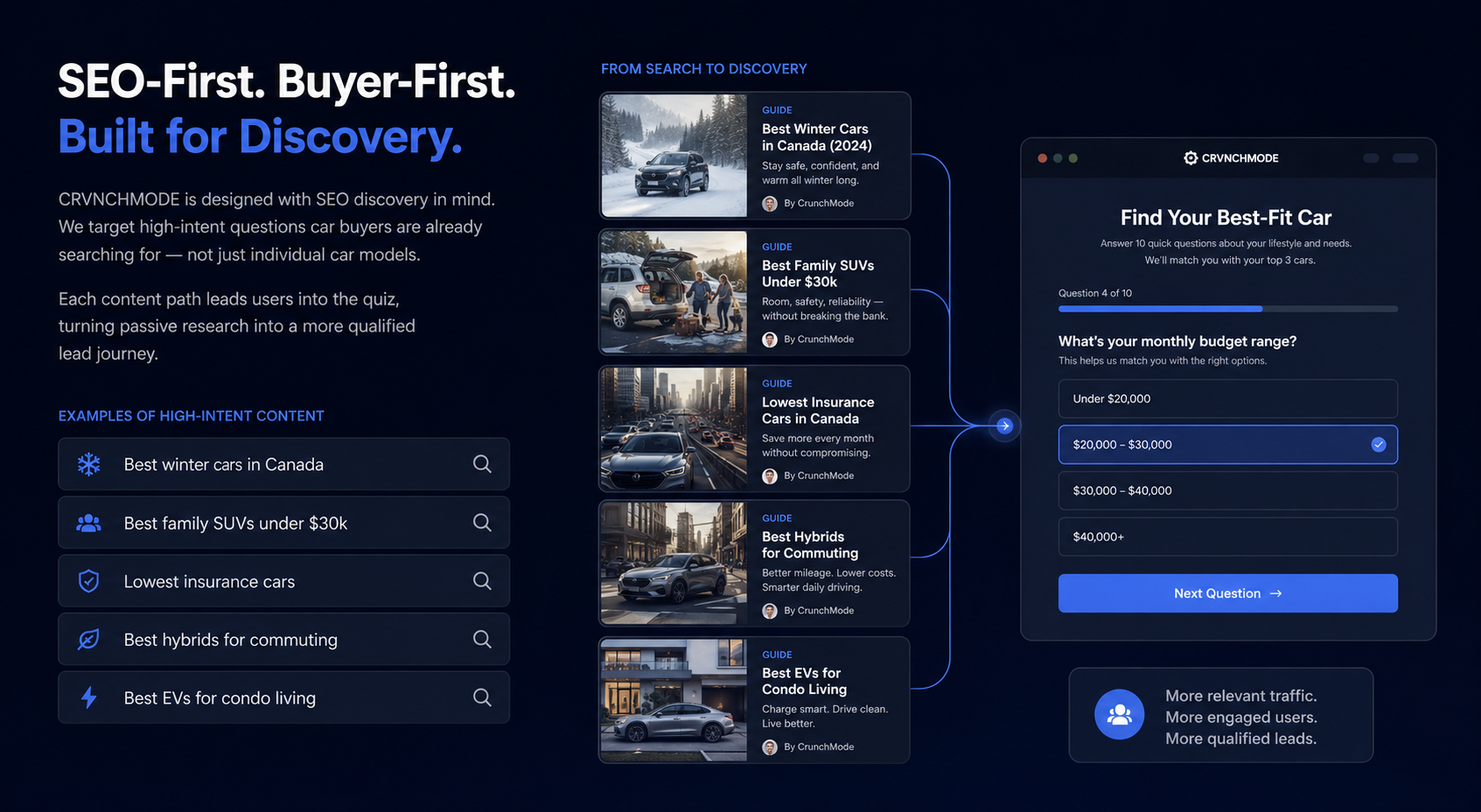
People don’t search for a quiz. They search “best winter cars in Canada” or “family SUVs under $30k”. I designed a content layer of intent-based guides that answer those questions and then hand off to the quiz, so research turns into a personal shortlist instead of another open tab.
07 / VISUAL DIRECTION
Editorial. Confident. Trustworthy.
Deep navy with a single electric blue (#2563EB) for actions, Inter for clarity, and modular cards so dense information stays scannable. The aim was to feel sharper than a dealership site without losing the calm a high-cost decision needs. Everything was designed mobile-first.
08 / THE JOURNEY
Trust first. Then the ask.
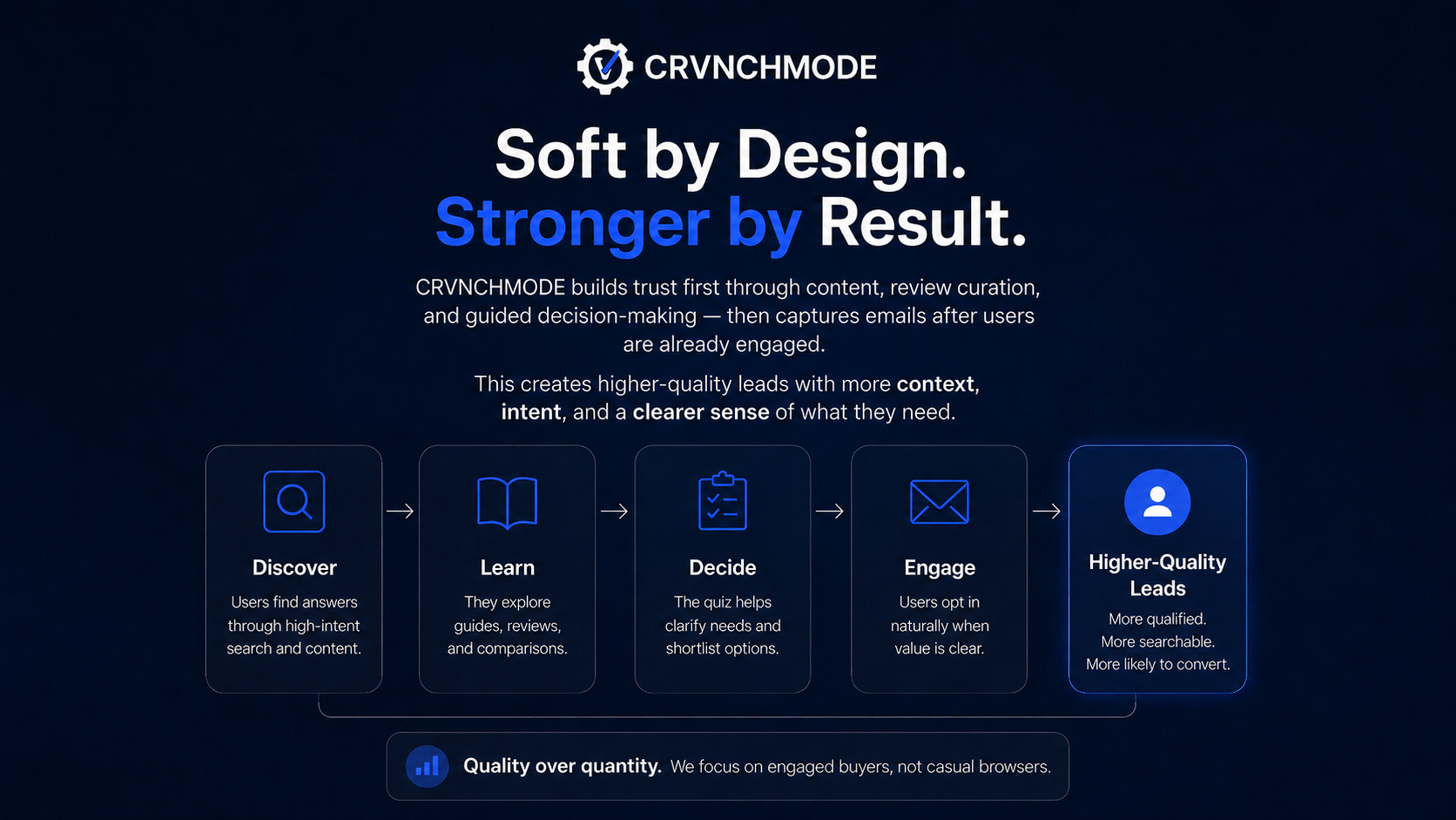
The intended flow is discover → learn → decide → engage. The email capture (a Smart Buyer Starter Guide) only appears after the buyer has received value, so anyone who opts in arrives with more context and clearer intent.
09 / WHAT I’D VALIDATE NEXT
Questions I’d put in front of real buyers.
- Quiz length: does completion hold up across all ten questions, or should some become optional?
- Pillars vs. one number: do buyers trust a broken-down score more than a single rating? A quick preference test with five to eight recent car buyers would tell me.
- Red flags: do visible downsides increase confidence, or scare people off good matches?
- Scoring weights: connect the pillars to real reliability, insurance and resale data sources before any score is shown as fact.
TAKE A CLOSER LOOK
Explore the experience.
The prototype walks through the homepage, the quiz and the results. Data is illustrative.